Lartisien

UX/UI Design
2023
Lartisien is a French-born luxury travel specialist dedicated to crafting unforgettable journeys for its members. It has access to the world’s finest hotels and the expertise to create one-of-a-kind itineraries, combining personalized services with seamless travel management services.

🛠️ About

  • Role: Design Lead
  • Toolkit: Figma

🚩 The Problem

It was noticed that desktop devices were driving the highest sessions and revenue. Hence, mobile UX needed to be revised. After a heuristic analysis and data check, some other opportunities to implement on the desktop were also identified.

🎯 The Objective

To improve user experience and increase the look-to-book ratio of the website, I was in charge of analyzing and delivering insights and recommendations for two critical pages of the current website:
- Room and rates page
- Checkout, Personal information and Payment

🧿HEURISTICS ANALYSIS

A heuristic evaluation is a usability inspection that helps identify usability problems in user interface (UI) design, with the aim of improving the overall user experience (UX).

The overall results from the heuristics evaluation show that there are some opportunities and areas to improve the Room & rates and check out page. Suggested improvements are the following:

  • - To enrich the user experience, the navigation menu should remain sticky across all pages of the website on both desktop and mobile
  • - The design language must consider consistency and hierarchy with CTAs ensuring typography, styling, and content throughout align.
  • - To improve the clarity the usage of high contrast of fonts and typography weights
  • - To achieve the purpose and impact of each section, the website should follow a hierarchy. Define clear spacing and consistency across different components
  • - Avoid drop down menus when there is only one selection in order to avoid confusion.
  • - Add carousel indicators to be able to differentiate between slides.
  • - Enhance user experience through a user-friendly and functional checkout process.
  • - To maintain the impact, keep the spacing consistent throughout. Implement better text blocks and components to minimize cognitive load.
  • - Add more visual like images or icons to help users capture information
  • - Always allow the users accessibility or back and close buttons
  • - Consider a clear progress bar in the user journey for checkout this will help the conversion rates,
  • - Avoid component that might appear clickable but do not respond

UX PHASE 🧱

This phase consisted of applying the heuristics findings, focusing mainly on mobile and considering a couple of points that must be included in the layout, such as:

  • - Handcrafted offers
  • - Membership Benefits
  • - Long Currencies
  • - Ability to book more than one room
  • - Upselling other services
  • - Error State
Rooms Listing Page

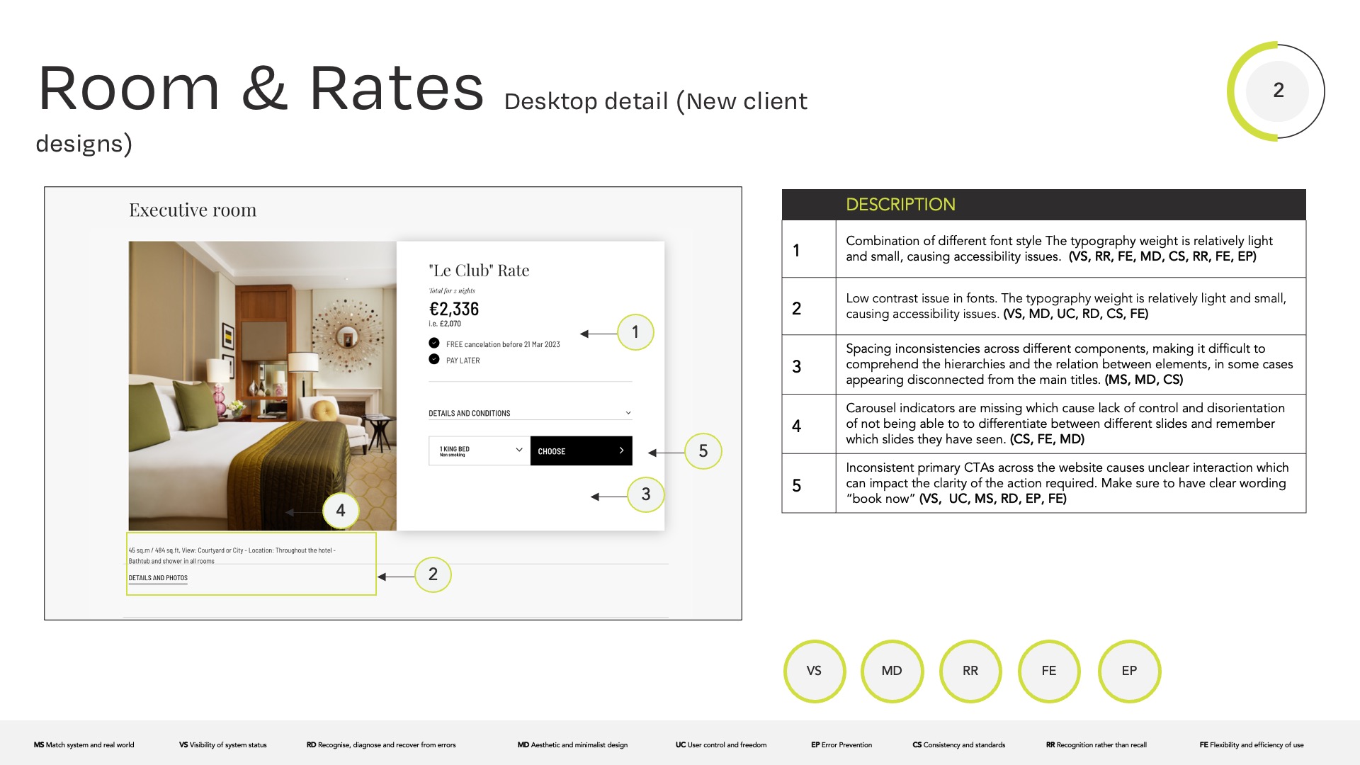
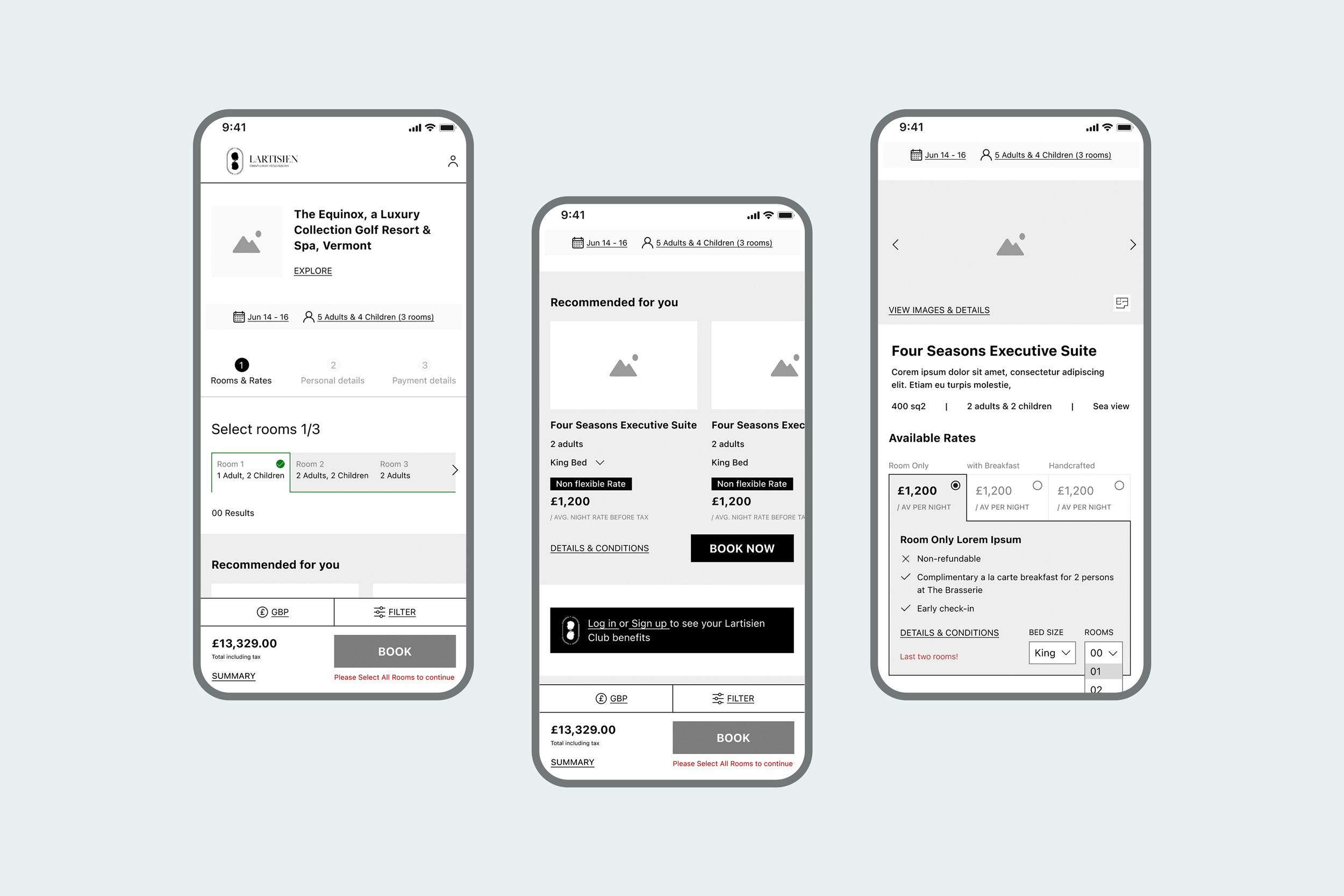
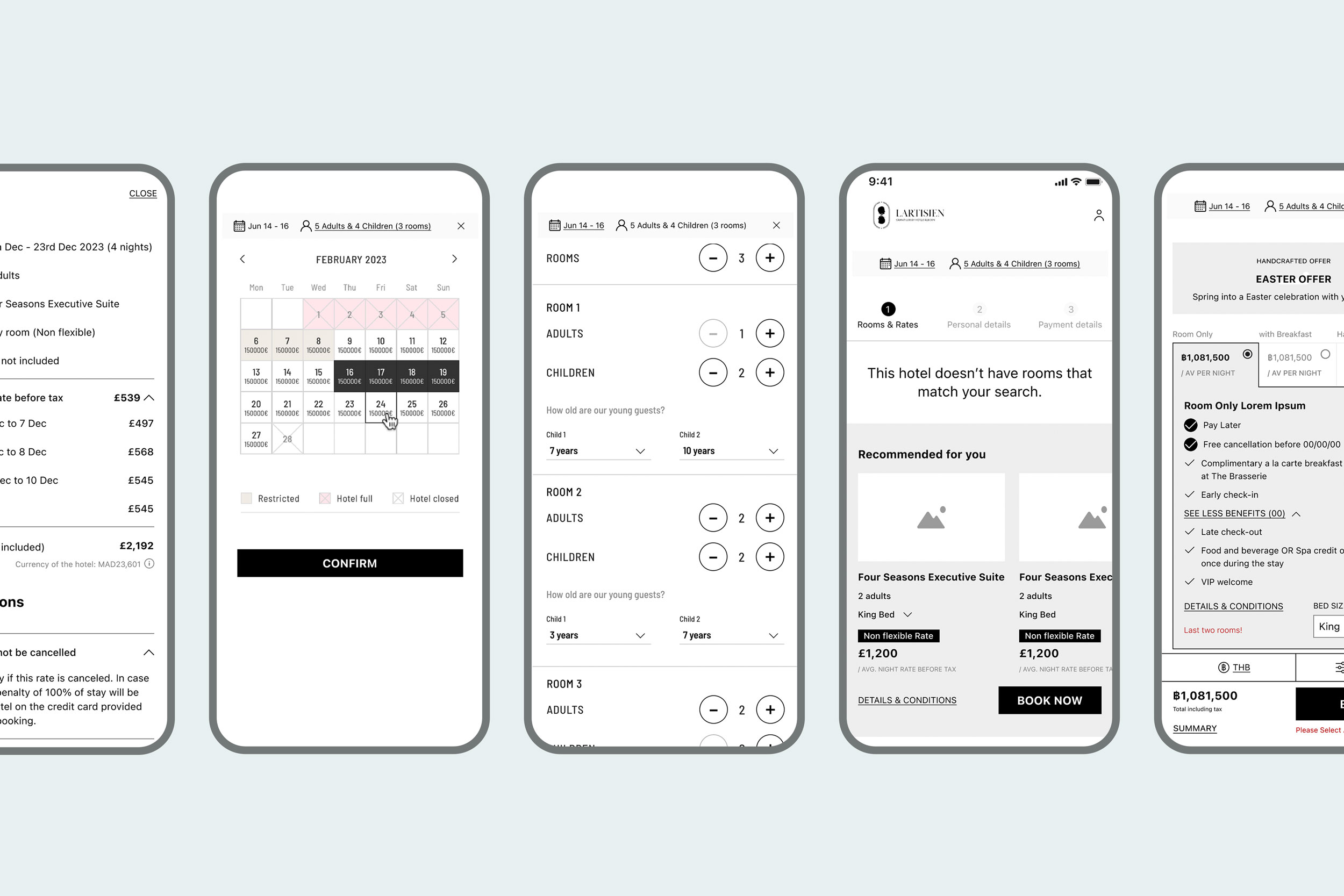
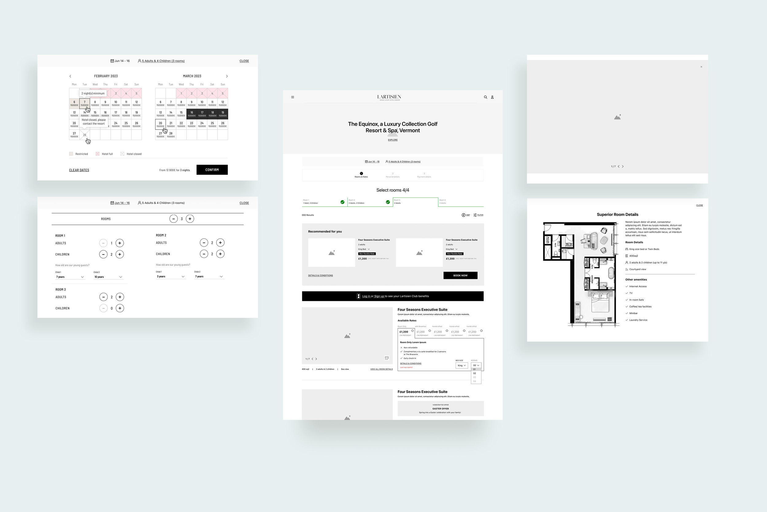
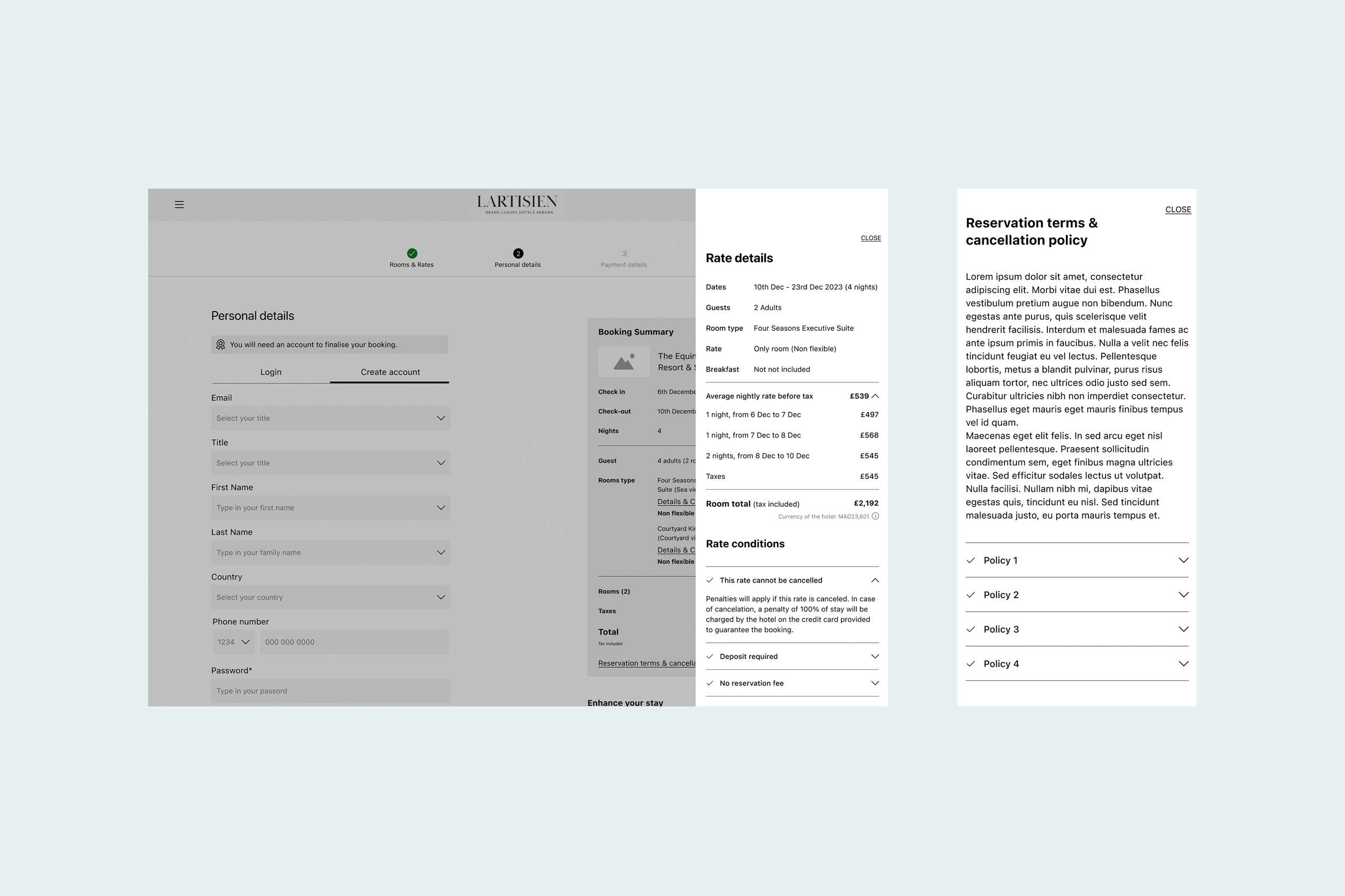
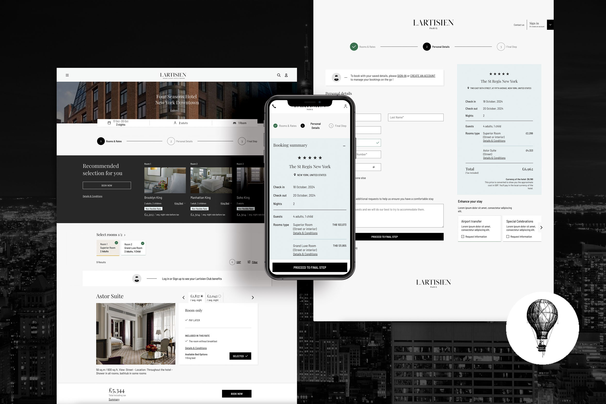
(1) The design ensures the user has complete visibility of their choices by showing the hotel availability they are currently choosing, the dates and capacity required (in sticky), and the total price for transparency. It also continuously informs the user that steps are needed to continue, providing a feeling that they are controlling the situation.

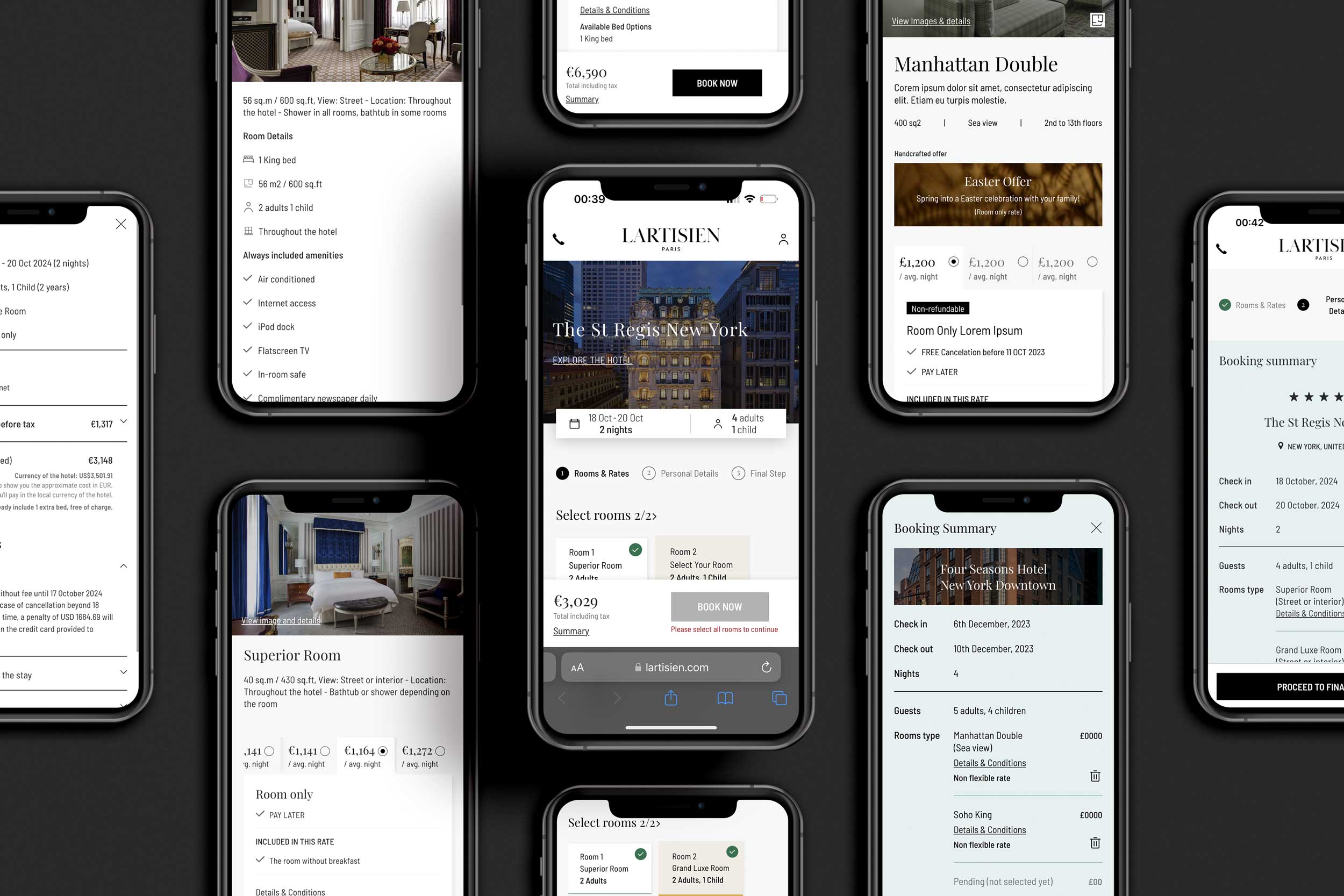
(2) Next, users will find a 'Lartisien suggestion' that offers a quick solution for complex bookings, relieving them from a potentially tedious process. We strongly encourage users to log in to unlock all possible benefits and ensure they don't miss out while scrolling.

(3) Finally, once the user decides to explore the available room fitting the requirements, it will ideally fit in one fold to avoid information overlapping with other rooms in the listing.

(1) A detailed summary page is needed for transparency.

(2) & (3) Switch between Dates & Room occupancy, on the second user gets to add children and must indicate their ages

(4) Error management with suggestions

(5) Edge case for long currencies

(1) Desktop Details

Checkout

(1) On the checkout, users must 'sign in' or 'create an account'; this has been signed and posted from previous pages, so it's not turning as a point. The disabled status informs the user they can't continue until this step is completed. Also, the step breadcrumbs help the user understand they are just one booking away from the booking completion.

(1) To reinforce the concept of transparency, there are several links with details & Privacy policy to ensure the user is doing a secure transaction and all it's under their control.

UI PHASE 🏩

As expressed in the Heuristic analysis, the website's lack of hierarchy and excessive font styles made it easier to read. The UI strategy includes a clean layout, bold hierarchy, and a sexy yet luxurious look and feel. The intelligent use of color keeps the website away from dull black and white. It is also a must to keep the user informed and draw their attention to the points we want to make, like recommendations, for example.

Crafting Dream Journeys