π οΈ About
- Role: UX/UI Designer
- Toolkit: Figma, Illustrator, After Effects, Photoshop
π© The Problem
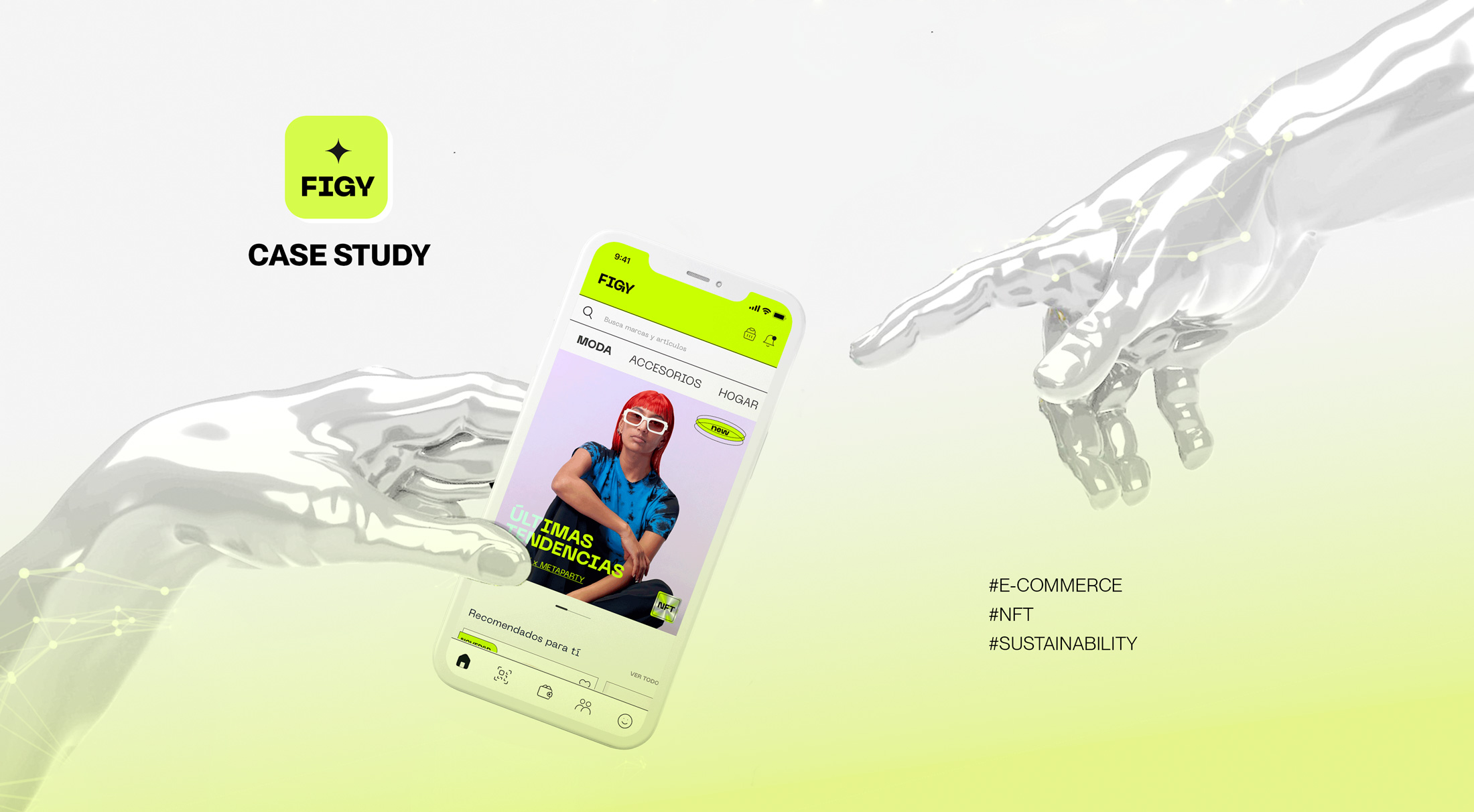
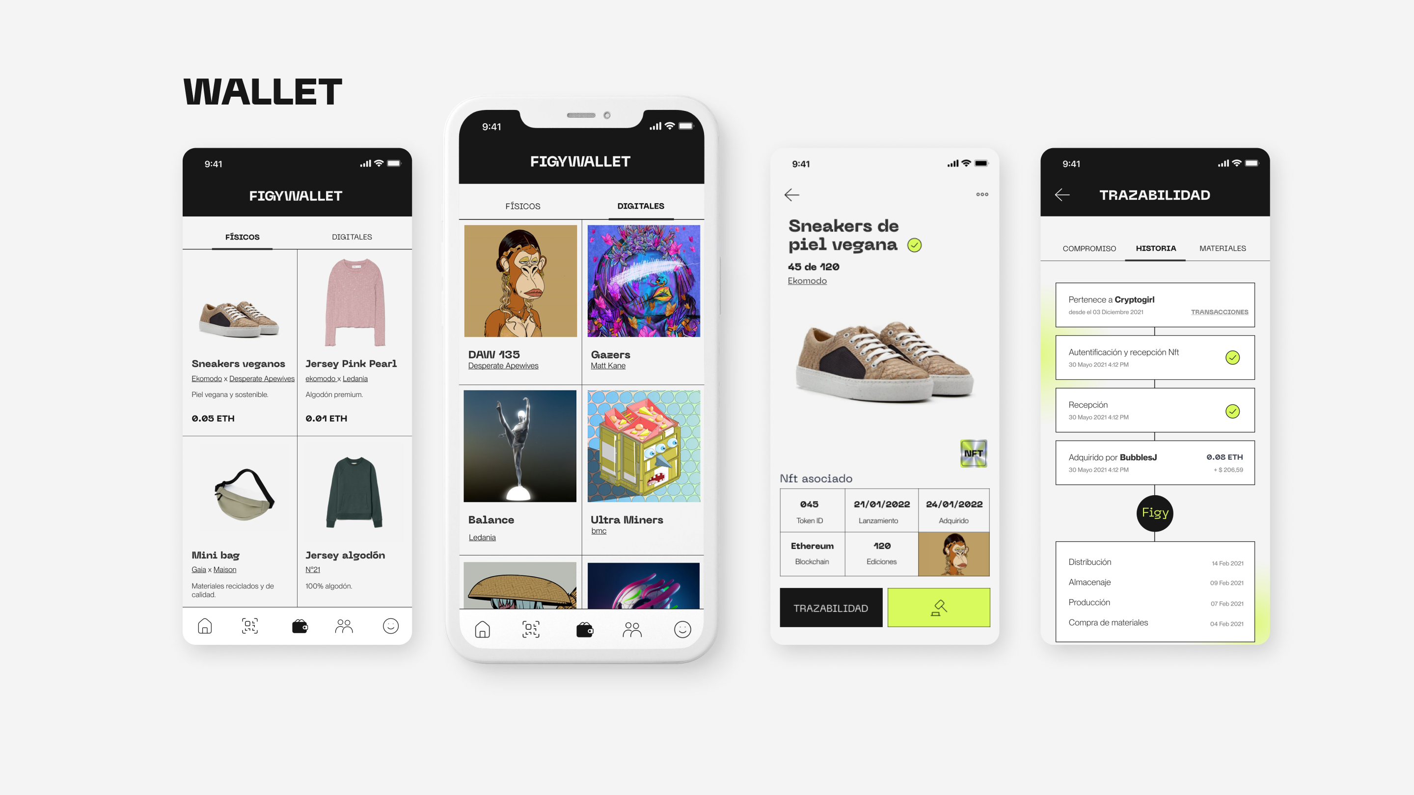
The world's consumption habits are higher than 50 years ago; the earth is facing many environmental problems caused by the excessive demand for resources; as a result, we live with the devastating consequences of climate change. Itβs our mother nature calling out for HELP!
As consumers, we have started to change habits, and the numbers and media speak loudly about it. The problem is when marketing labels everything green, making it confusing and difficult to differentiate a sustainable product from one that is not.
π― The Objective
To create a marketplace app where e-commerce, art, and NFT coexist. Created for phygital & sustainability lovers where the community can buy, sell, collect art & learn more about crypto.
Research & benchmarking
As this project did not have a lot of references in the market, we started by understanding how the market was behaving around the NFT to use for benchmark, and then we conducted a series of interviews where we could identify patterns & personas.


π₯ Personas & Target Audience
- Individuals connected by sustainability
- Another way of purchasing & avoiding green-washing
- Able to use technology for nature's service
- High community value & sustainability


UX PHASE
For the UX, we started by establishing the app's skeleton; it was the key to understanding how to set the hierarchies for the content and think about how the key functionalities should be included in the navigation.

The architecture was only developed for the buyer persona.
After organizing all the features the app should have and the sketches, we got the first ideas for the navigation flows and how the user could efficiently perform the tasks of each functionality; this helped us get the first approach to solving the proposed problems.

During the wire-framing stage, only the key screens were developed to understand how many journeys we needed to include and then, later in the UI, possibly complete those journeys as we iterated the products with user tests. Here we focused on Homepage, PDP & Wallet.
Thanks to different tests performed on users, we could amend essential things like the navigation bar, where the arrangement of the buttons was complex; for example, the home button is usually placed at the extreme right like on social media.

UI PHASE π¦
We started by defining the brand personality: If FIGY were a person, it would be like Billie Eilish, eccentric, different, extravagant, unapologetic, and with a bold personality!
MOODBOARD & INSPO


Figy is a young, philanthropic and entrepreneurial character.
They support sustainable causes and take advantage of technology to generate social impact and promote the circular economy.


AD π₯


