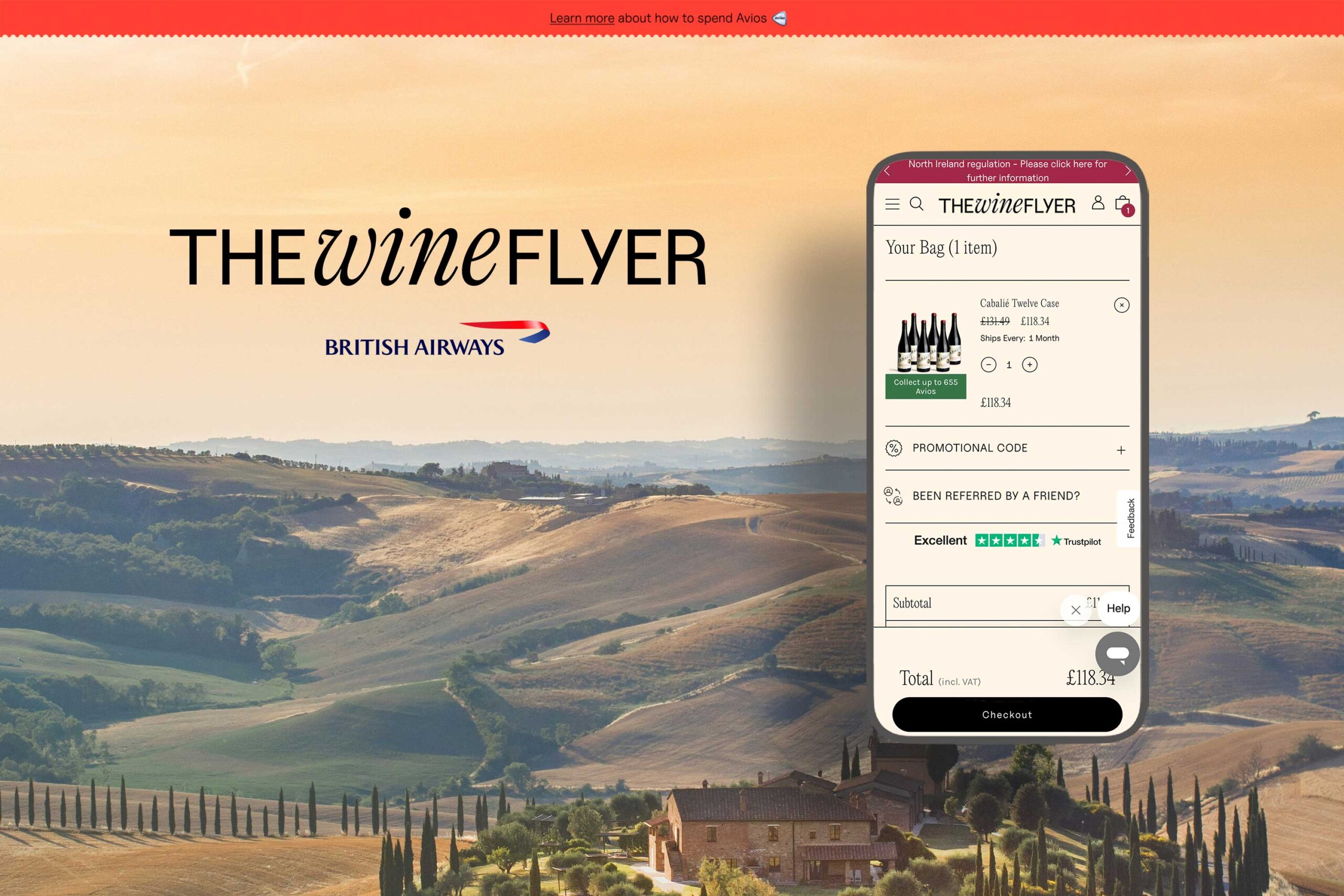
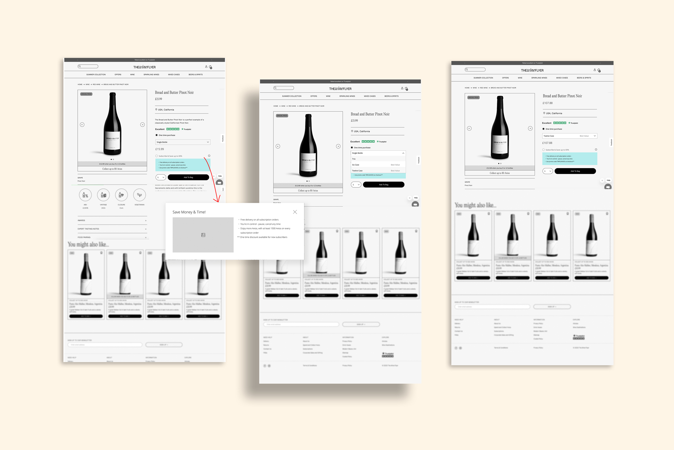
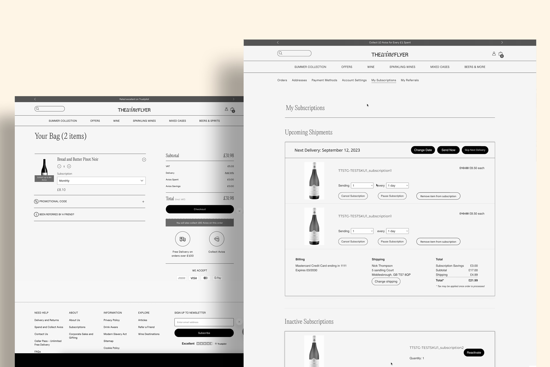
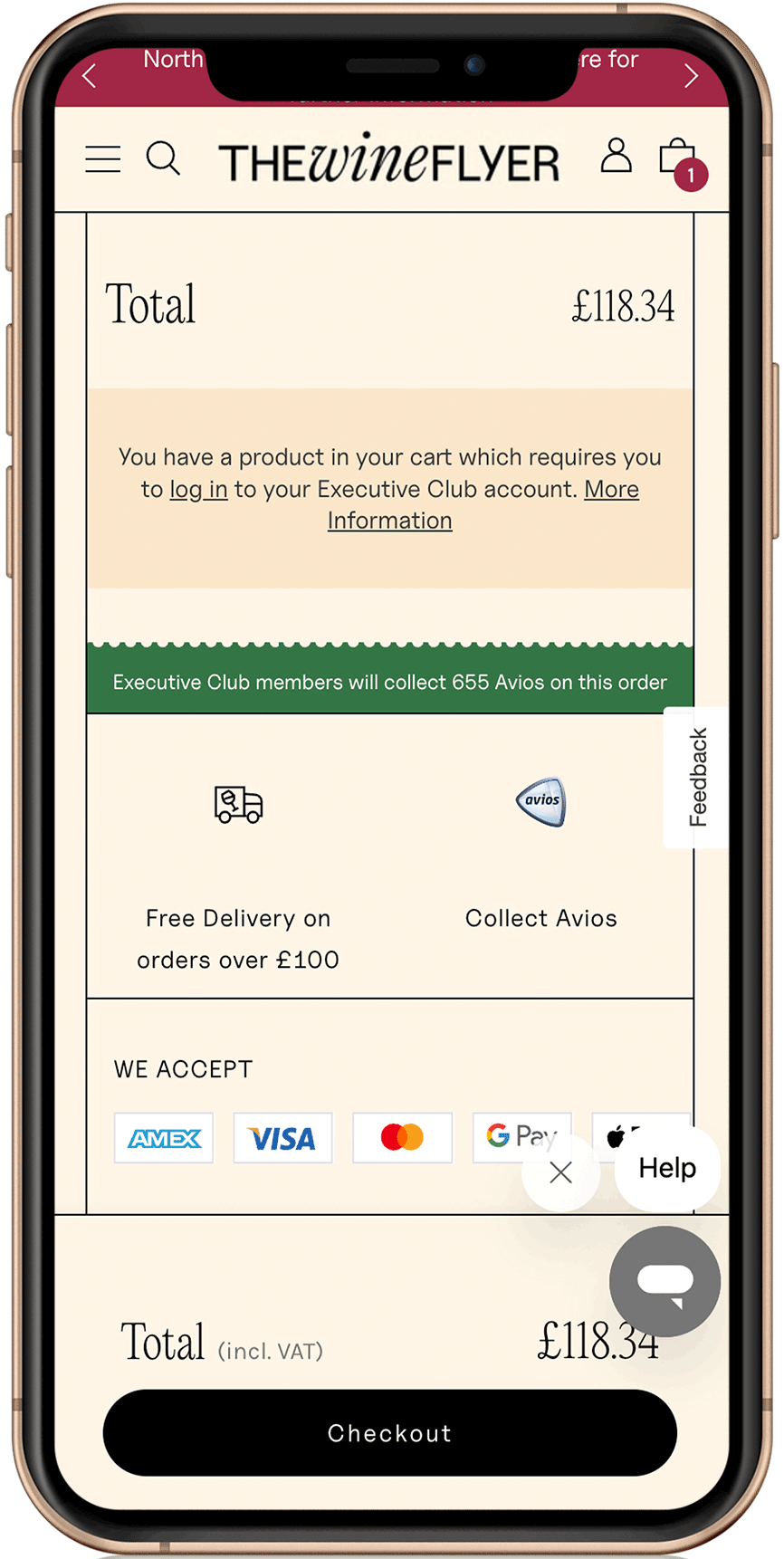
The Wine Flyer

UX Design
2022-2023
The Wine Flyer, an exclusive club for British Airways Executive Club Members, offers a selection of the finest wines from around the world. As a member, users can collect Avios points for every £ they spend on an extensive range of wine varieties, enhancing their loyalty program benefits. The Wine Flyer has undergone significant improvements to enhance your experience. In 2022, they upgraded their UX/UI, making wine shopping more enjoyable. In 2023, they underwent a rebranding, reflecting their commitment to providing you with the best wine selection and service.

🛠️ About

  • Role: UX/UI Designer
  • Toolkit: Figma
  • Platform: Big Commerce

🚩 The Problem

TWF requires all customers to be members of the British Airways Executive Club to order. To scale the business in 2023, there was a need to expand the scope of TWF to allow non-members of the Executive Club to order and complete transactions. Therefore a desire to explore and implement a ‘Guest checkout’ & Wine subscriptions.

🎯 The Objective

1. Create a UX 'Guest Checkout' flow for testing, showcasing the benefits of creating an Executive Club account.
2. To persuade the user on the PDP to choose a subscription instead of a one-time purchase.

UX PHASE 1

Beyond implementing the 'guest checkout,' some of the inputs that we considered too were:

1. Collecting age data: as this website sells alcohol, the legal drinking age should be above 18.
2. Provide a solution for guests to register into the Executive Club after ordering that enables user acquisition.
.3. Provide solutions for guest users to claim the Avios once they created an account retrospectively.

🛒 GUEST CHECKOUT [Initial design]

PLAY

Usability Study

This functionality was taken to a usability test. The approach was a remote study, unmoderated using usertesting.com, where the respondents were UK-based, 45+, and mix of tiers, the majority of them part of the actual Executive Club program.

The test results came into three sections:

  • RETAIN
    • - No significant usability issues were observed with the overall flow and UX
    • - Conceptually, all respondents are comfortable with guest checkout in the context of TWF
    • - Subscriptions/Cellar Pass mandatory login experience didn’t present any significant issues
  • REFINE
    • - There are opportunities to optimize the copy and CTA on the new guest checkout flow.
    • - Add a register CTA on the guest checkout initial screen (potentially using repeat purchases to influence).
    • - Make it more apparent that the Executive Club is associated with British Airways.
    • - Make it clearer that users can use Avios to reduce the cost of their order.
    • - Expose some of this ‘benefits’ information without requiring UI interaction (focusing on earning Avios, repeat orders, and price reduction).
  • REMOVE
    • - Do not progress with the ‘auto retro’ process
    • - Indicators seen that Guest customers are likely to have a lack of understanding about the Avios and EC propositions, meaning:

      1.They’re unlikely to engage with an ‘auto retro’ proposition
      2. Curating/explaining the Avios/EC propositions is likely to risk overall engagement at the point of sale

🛒 GUEST CHECKOUT [Iteration]

UX PHASE 2

🛒 SUBSCRIPTIONS

The brief was simple; the client was seeking the implementation of 'Order Groove' to manage subscriptions.

The idea was to highlight the benefits when subscribing, where it was explored the copy, to be price or led & Avios points led, to be tested in the future. Also, a tooltip was added to minimize the user's fears and have a handy tool to answer possible questions.

The subscriptions never reached the UI phase. Currently, it's being implemented in one SKU on the website.

UI PHASE 🍄

The UI was straightforward, and the new branding was implemented on the rest of the website. Hence, the checkout had to differentiate the warning messages to help the user guide the interface, given that the new branding was bold and colorful and could create confusion.