AIDesign SystemUI Design

Nomist App | Concept Design & Art Direction

🛠️ TOOLKIT

  • ChatGPT
  • Toolkit: Figma, Fig Jam
  • Freepik | Seedream 4k | Kling 2.5
  • Eleven Labs

🗓️TIMELINE

  • 4 Weeks

🚩 MY ROLE & PROCESS

I was brought in at the earliest concept stage, before any visual direction existed. My mandate ran across two parallel streams from day one.

🎯 Stream 1: Concept Design Direction

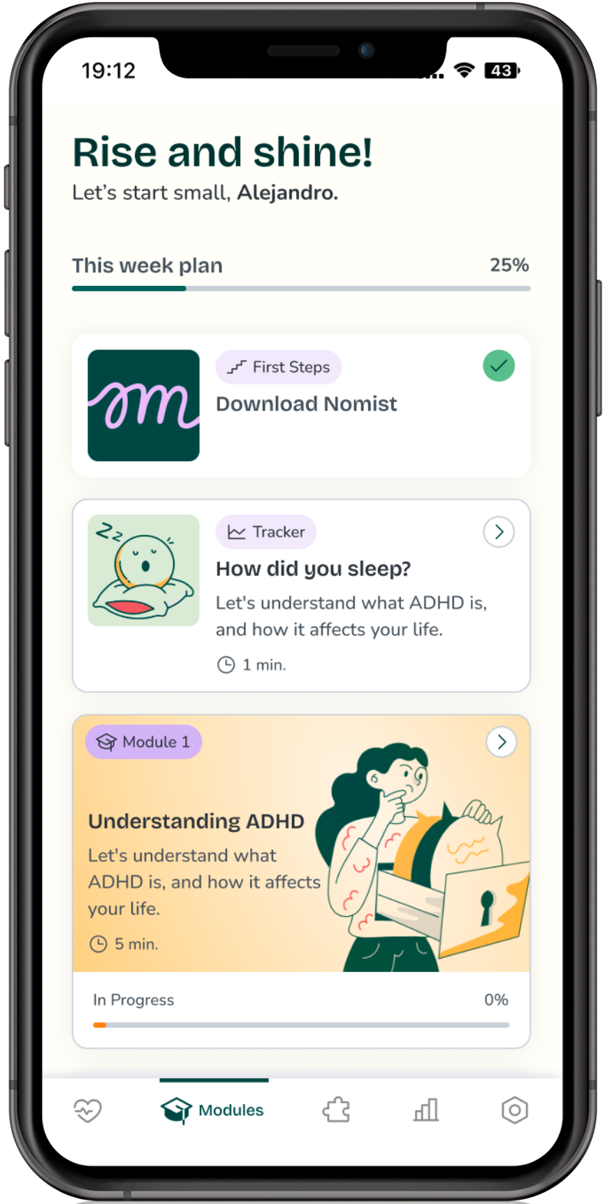
Defining the product's visual language, tone of voice, and interface direction for the MVP. This involved producing two fully realised design concept directions (Calm Focus and Playful Momentum), presenting them to the product team, and leading the final design decision and rationale.

🎯 Stream 2: Figma Design System (MVP)

Building the Figma Design System that the development team would use to implement the MVP. This was not a post-concept activity — it ran in parallel, informed by the concept work and translating its decisions into a scalable token-based system ready for handoff.

DESIGN FOR FOCUS, NOT GUILT.

🧿 PROJECT OVERVIEW

Nomist is a digital health app designed to support adults with ADHD through a combined, personalised treatment path. The product integrates cognitive stimulation games, CBT-based therapeutic modules, habit and biomarker tracking, and a community layer — positioning itself as a key to self-understanding for a population that abandons traditional interventions quickly.
The product brief described Nomist's personality in precise terms:

  • Clinical Guide BUT NOT A brain game or diagnosis
  • Empathetic BUT NOT Indulgent
  • Action-oriented BUT NOT Hyperactive
  • Data-driven BUT NOT Judgmental
  • Sophisticated BUT NOT Elistist
  • Intuitive BUT NOT Predictable
  • Guide BUT NOT Rigid/Stiff

The project sat at the intersection of two worlds that rarely speak the same language: clinical rigour (Class 2a medical device certification, with all the precision and regulatory constraint that implies) and ADHD-specific UX — where users experience frustration quickly, navigate non-linearly, and abandon products at high rates. Every design decision had to serve both.

🛠️ CONCEPT EXPLORATION

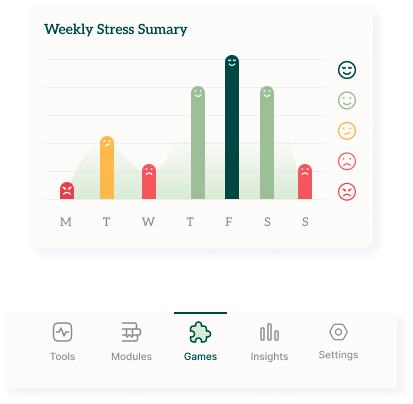
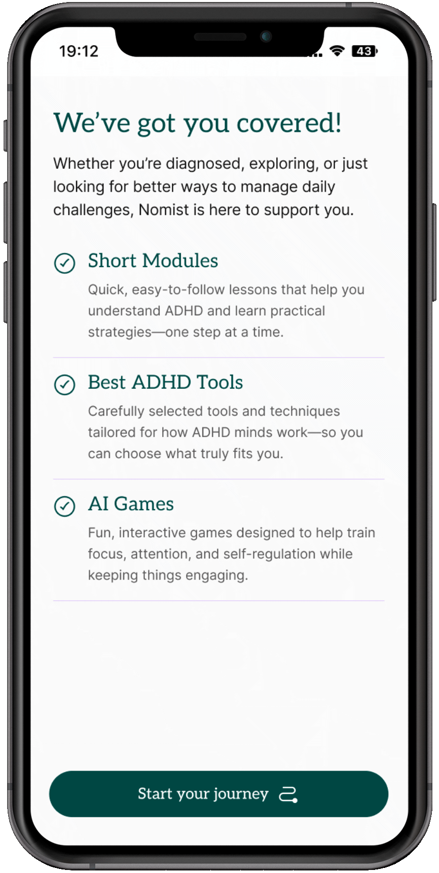
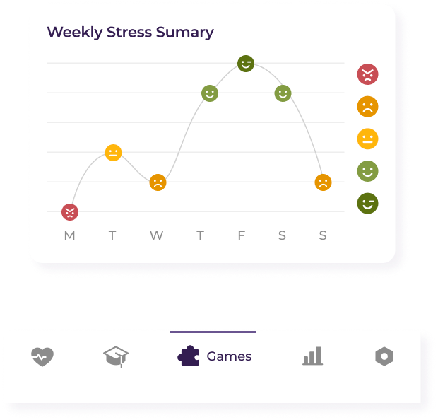
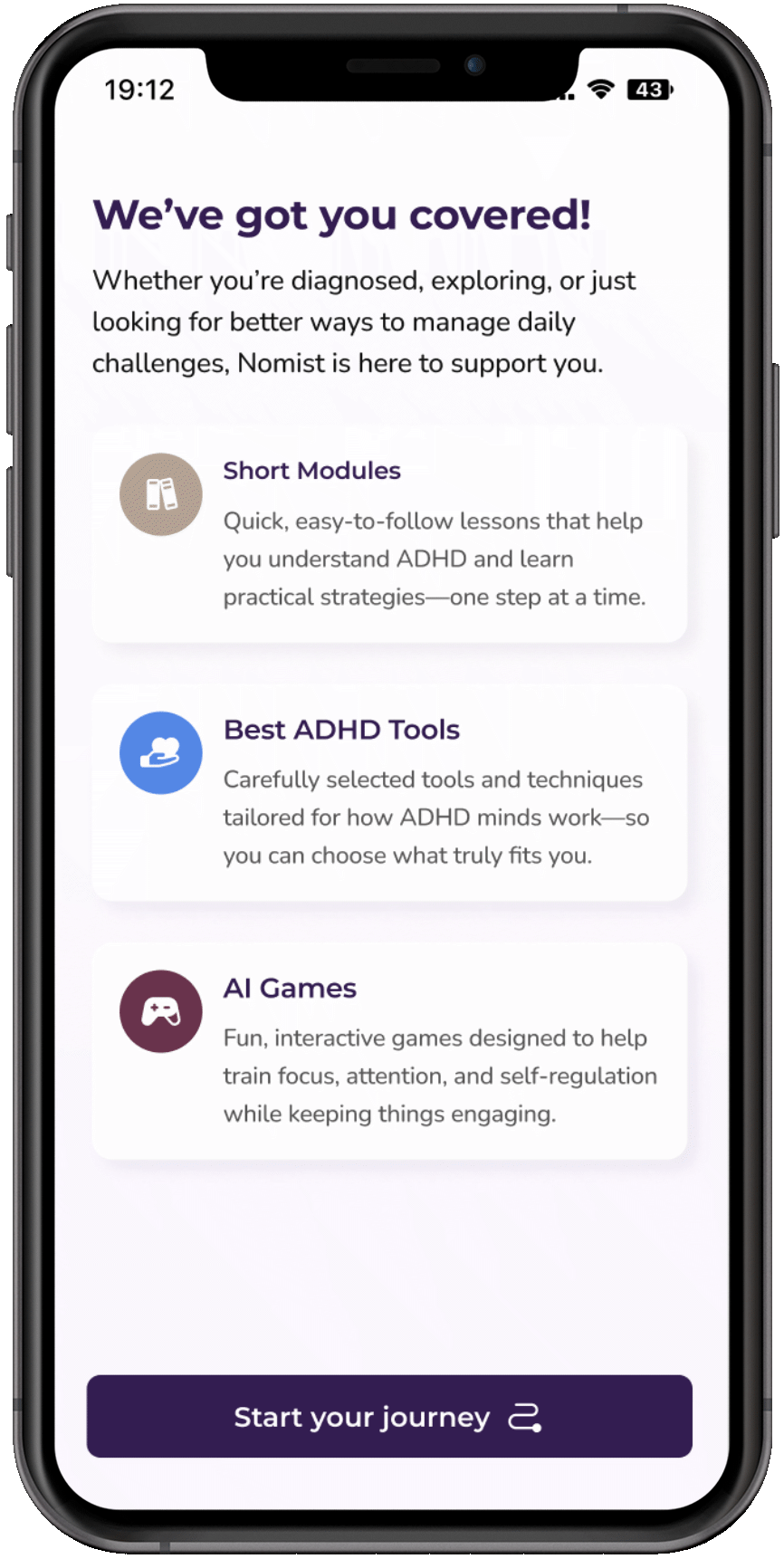
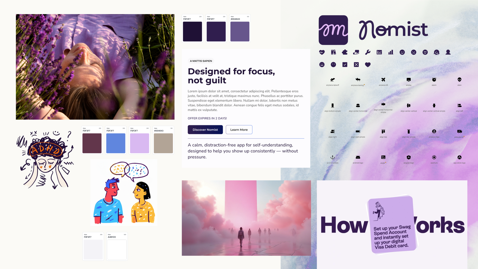
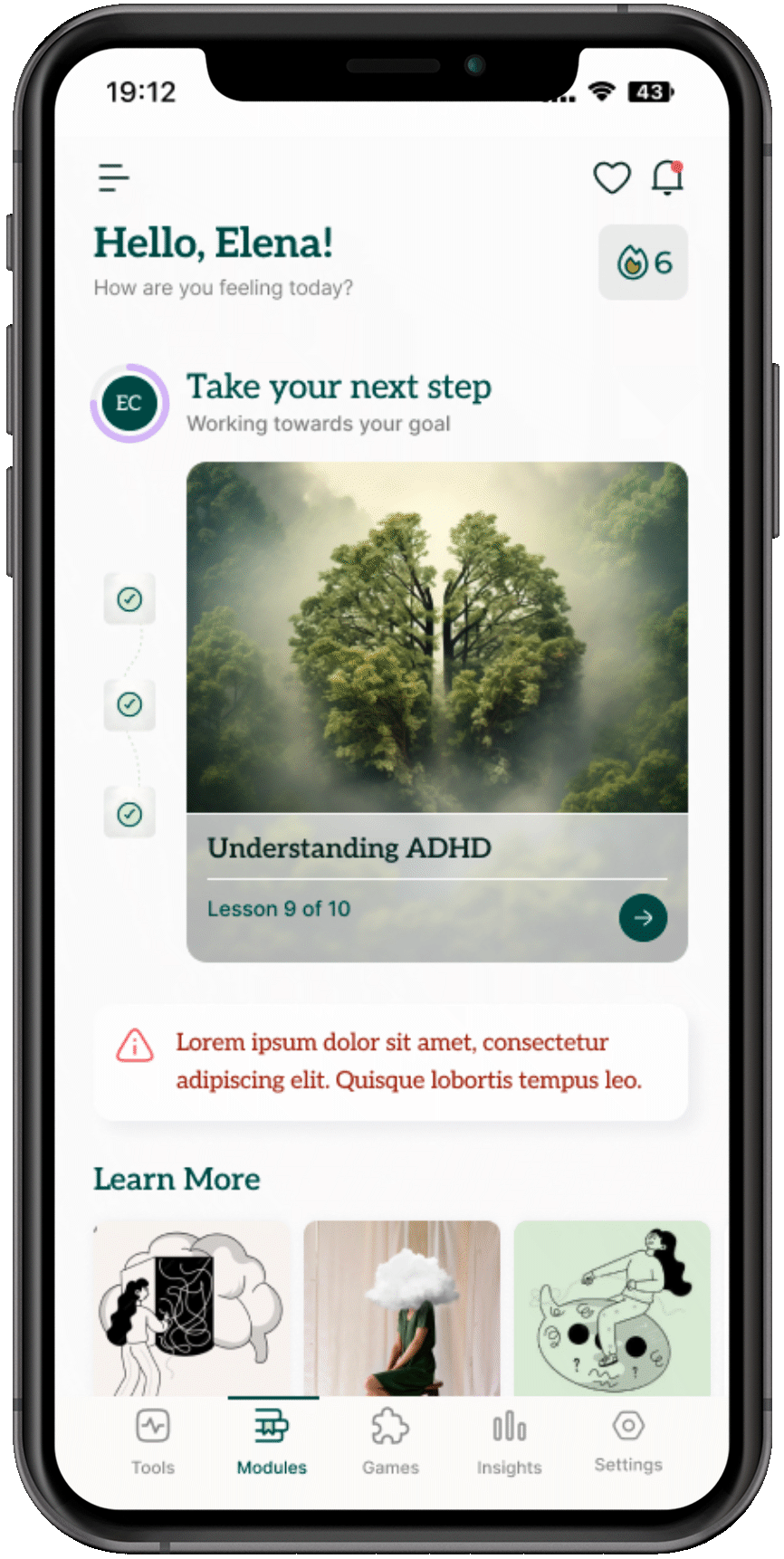
I developed two fully distinct design directions, each with its own color rationale, typography system, illustration approach, iconography style, and UI in practice screens. This was a genuine exploration — not a safe vs. bold split, but two internally coherent visions of what Nomist could be.

CONCEPT 1 — Calm Focus

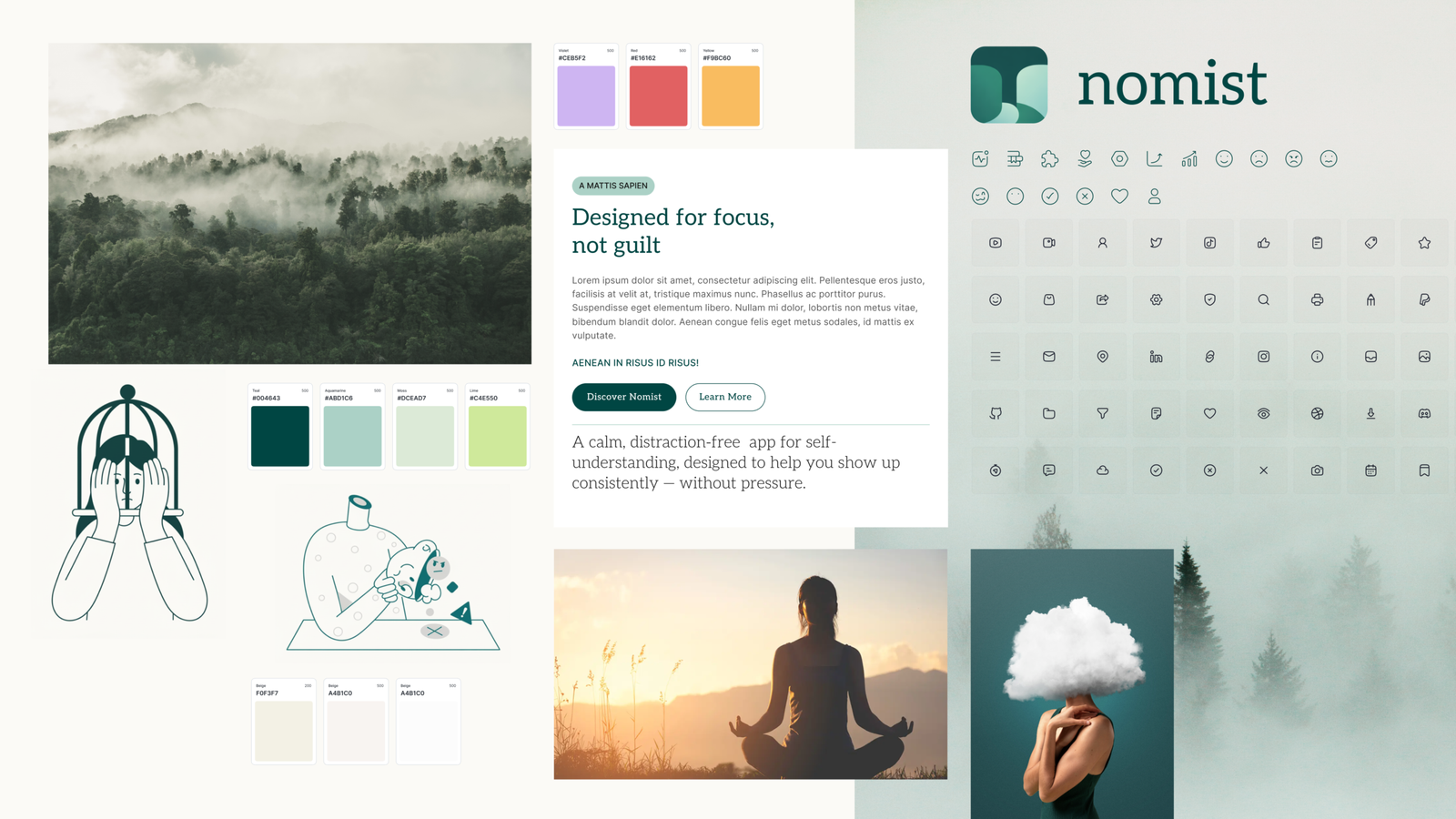
Calm Focus was designed as a low-stimulation, emotionally safe environment. Its entire design logic flows from one insight: for people managing ADHD, the biggest barrier is not capability — it is the emotional weight of trying again after repeated failures with other tools.

Color rationale: Three functions.

  • Trust — natural greens and teals establish emotional grounding.
  • Clarity — muted neutrals reduce visual fatigue for long sessions.
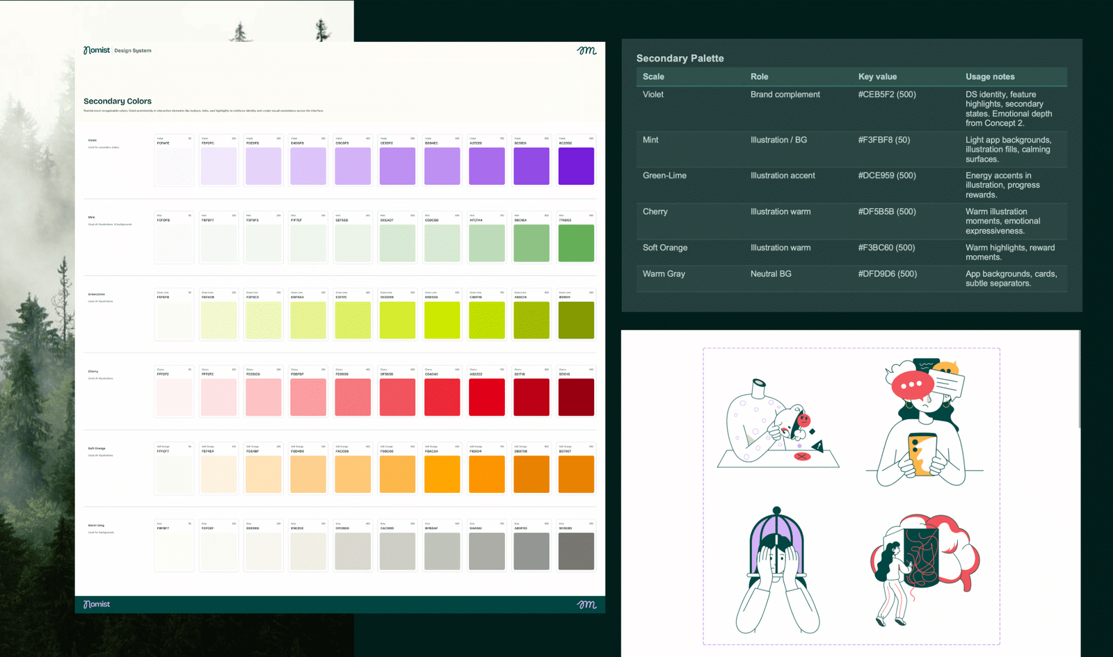
  • Feedback — expressive secondary colors (violet, red, yellow) used sparingly for states and guidance.

CONCEPT 2 — Playful Momentum

Playful Momentum took the opposite angle: rather than reducing stimulation, it harnessed it. ADHD brains are often better motivated by visible energy and reward signals than by calm — and this concept explored whether a more expressive, high-contrast design could support engagement without tipping into overwhelm.

Color rationale: Three functions.

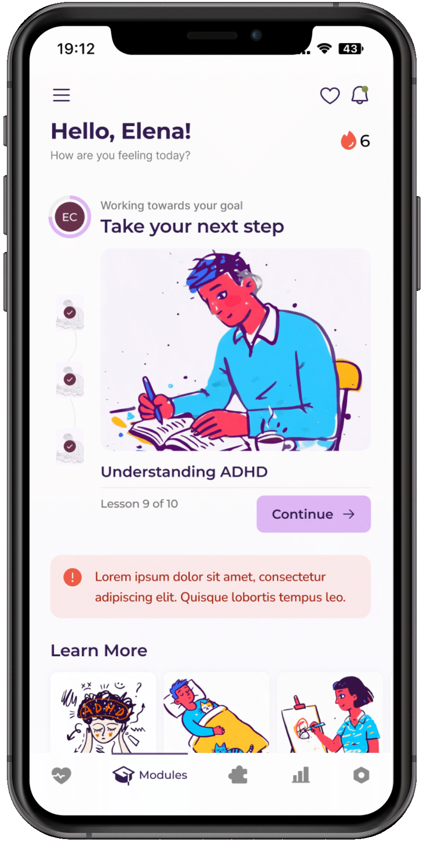
  • Purple was chosen deliberately for its psychology in mental health contexts — it blends blue's stability with red's warmth, supporting emotional awareness while motivating action.
  • Not a decorative choice: an evidence-informed one.

💡THE DECISION:
Calm Focus was selected as the direction, refined with specific elements borrowed from Playful Momentum.

  • Key refinements carried from Concept 2 into the final direction:
  • - Typography upgraded from Aleo/Inter to Bricolage Grotesque + Nunito — more contemporary, less editorial, better suited to the playful illustrations and soft UI shapes of the Calm Focus system.
  • - Violet introduced as a secondary brand color alongside the primary Teal, adding emotional depth and the creativity signal from Playful Momentum's rationale without the visual energy of full purple.
  • - Icon library shifted to Phosphor Icons (outlined) — combining the gentle non-imposing quality of Concept 1 with the accessibility and quick-recognition properties identified in the Concept 2 evaluation.

DESIGN SYSTEM — What I Built

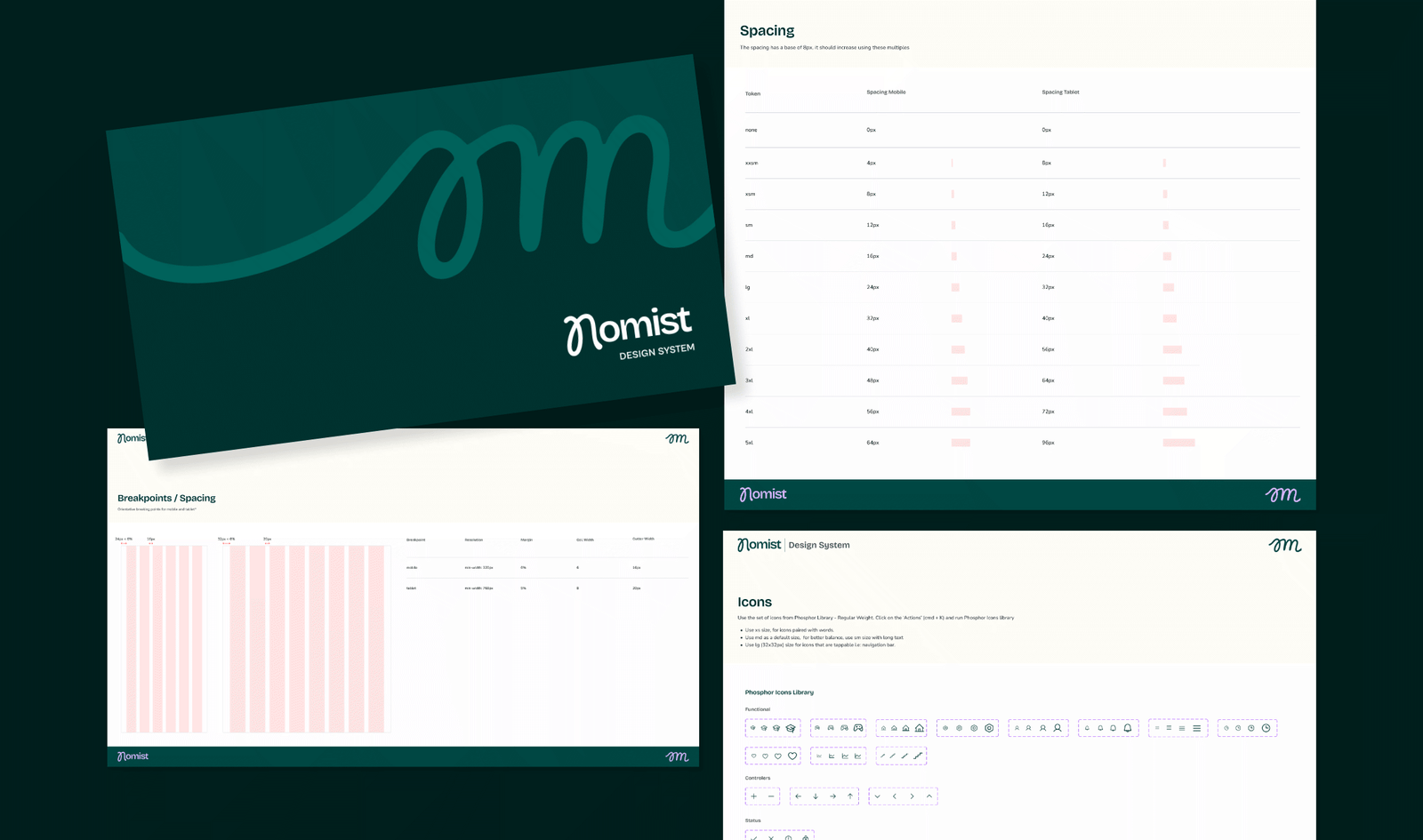
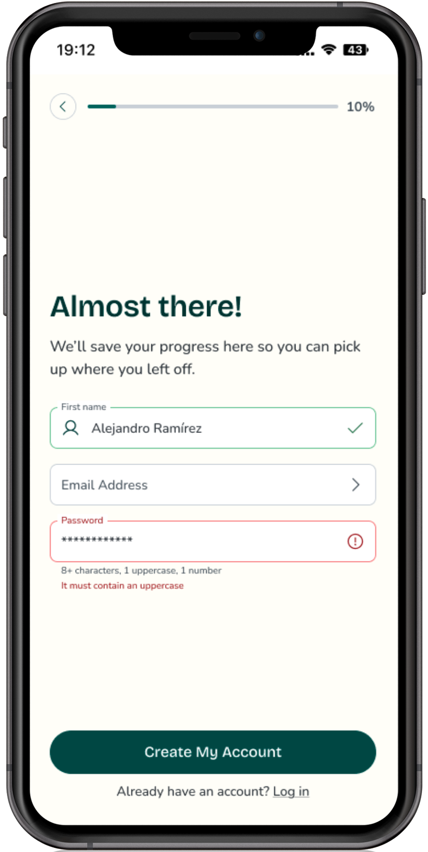
The Figma Design System translates all concept decisions into a structured, developer-ready system. It was built natively in Figma with a token-first architecture, meaning every value is defined once and referenced semantically throughout.

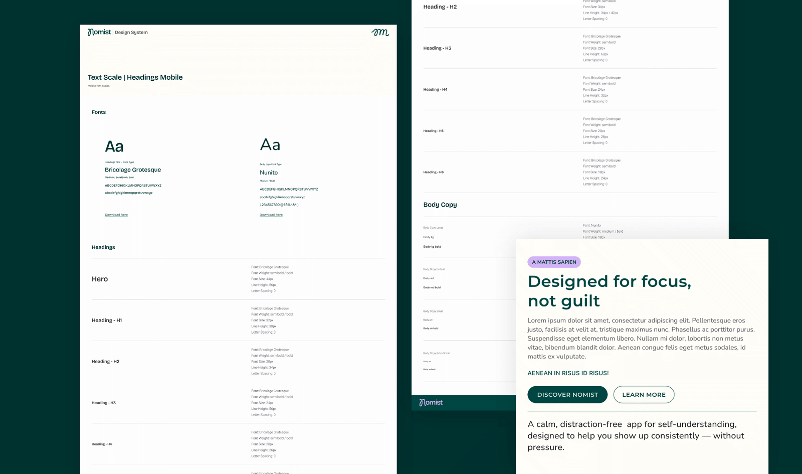
👉🏼 Typography

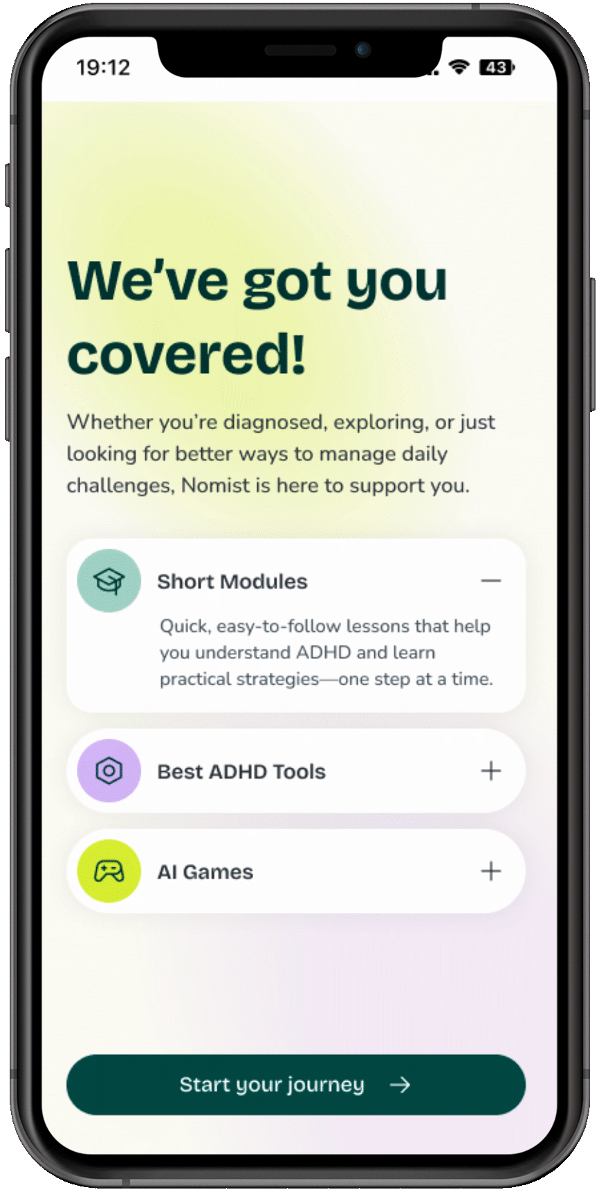
The final type system is Bricolage Grotesque + Nunito — chosen over the original Aleo/Inter pairing in the final concept review. The rationale was precision: Bricolage's subtle quirks align with mental health messaging ('you don't have to be perfect'), while Nunito's rounded terminals reduce visual tension for the long-form reading that CBT modules and reflection content require.

🎨 Color System

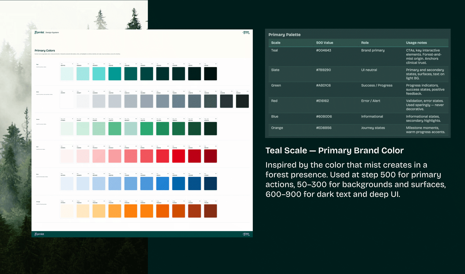
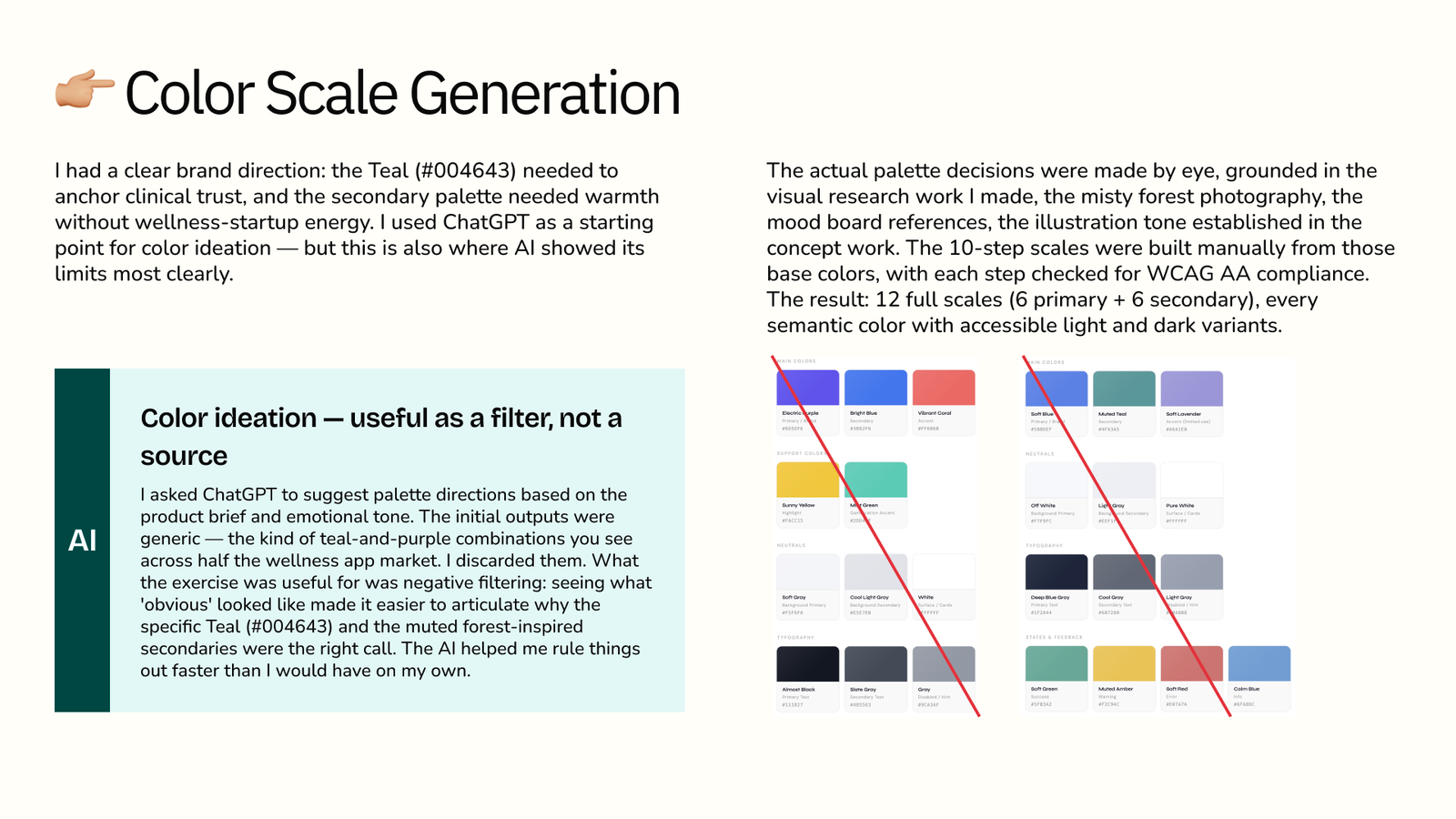
Full 10-step scales (50→900) for all palette entries, generated for perceptual evenness and WCAG AA compliance. Split into Primary and Secondary palettes with distinct semantic roles. The color rationale traces directly back to the concept decision: nature-inspired, clinical but warm, with expressive secondary colors used as guidance rather than decoration.

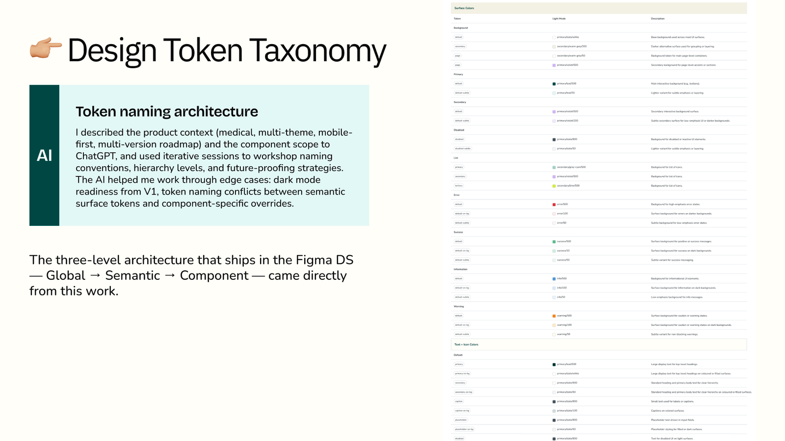
🧩 Semantic Token Architecture

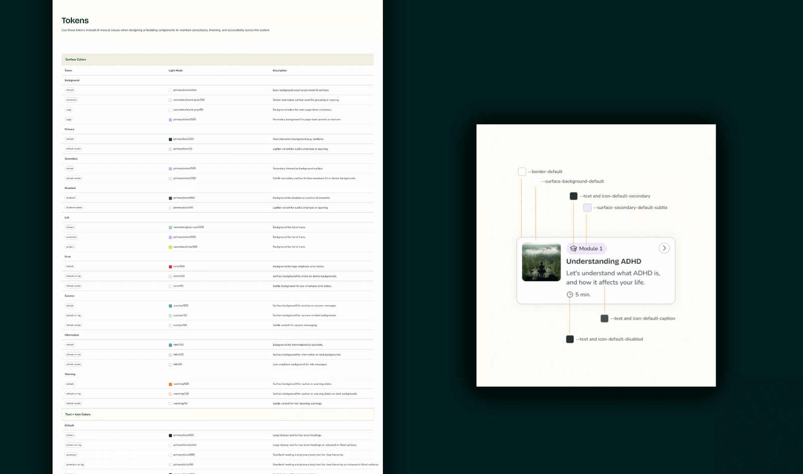
Three-level token hierarchy designed for multi-version roadmap (V1→V4), dark mode readiness, and multi-team handoff without component-level changes.

Every token is documented in the DS with its mapped value and a plain-language description. This makes handoff frictionless and enables future theming — including dark mode or a clinical dashboard variant — without touching component files.

HOW I INTEGRATED AI

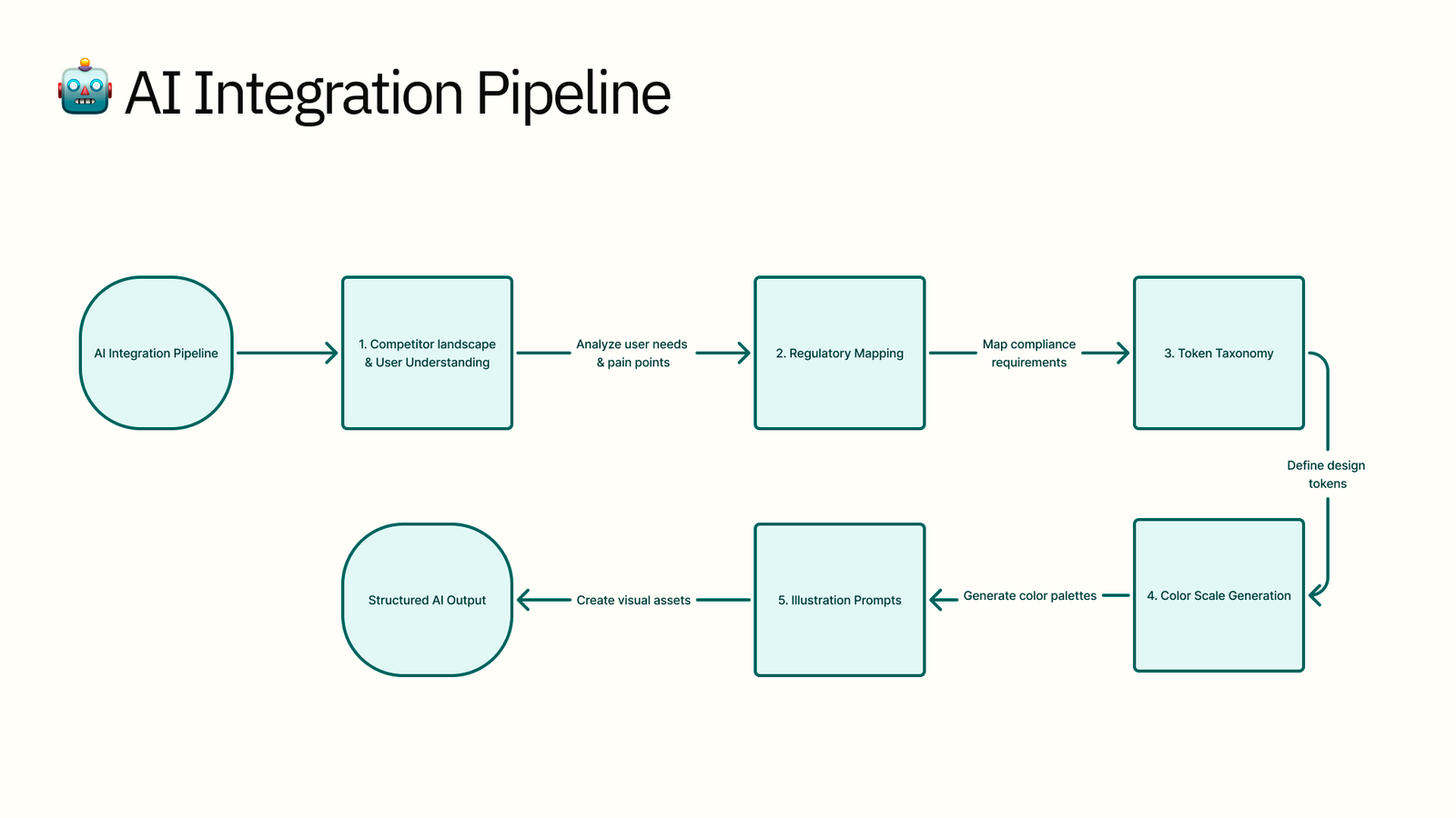
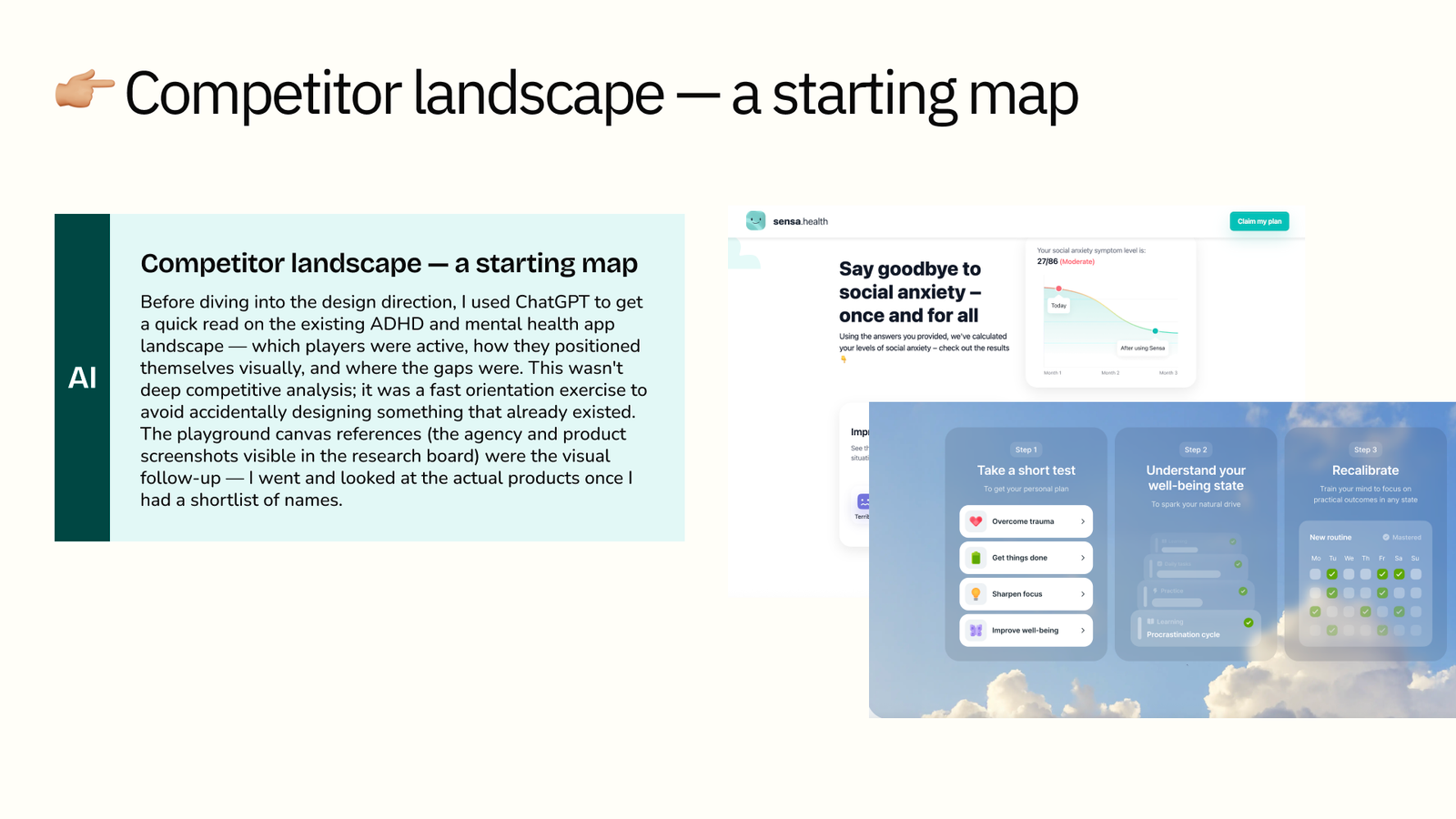
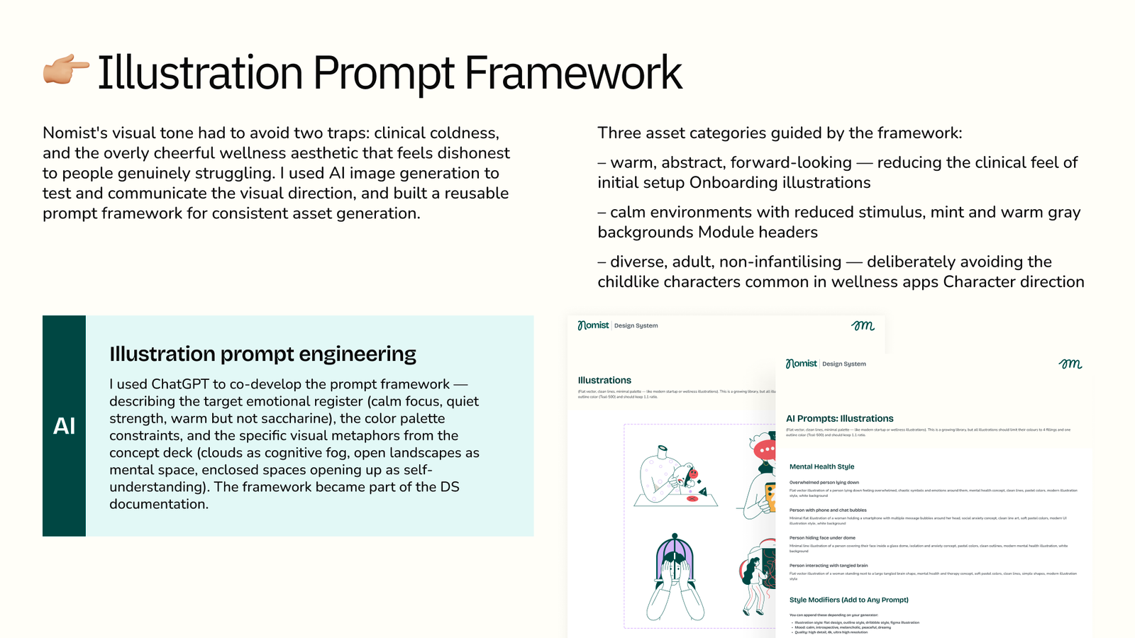
AI was woven into every phase of this project — not as a shortcut, but as a structured thinking partner that compressed research time and allowed me to make better-informed decisions faster. Below are the five specific ways it shaped the work.

BONUS — EXTENDED AI EXPERIMENT

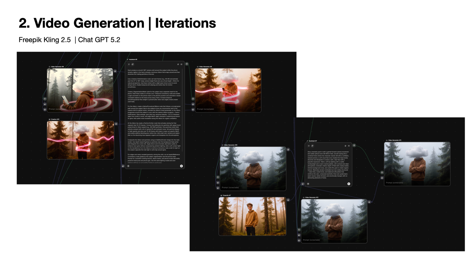
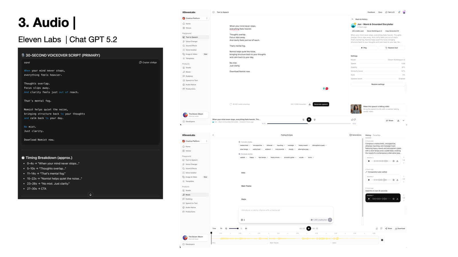
AI-Produced Video Ad

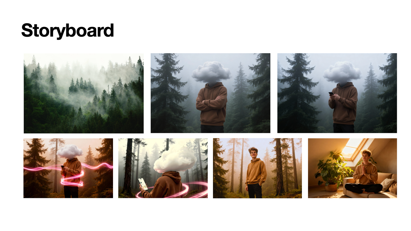
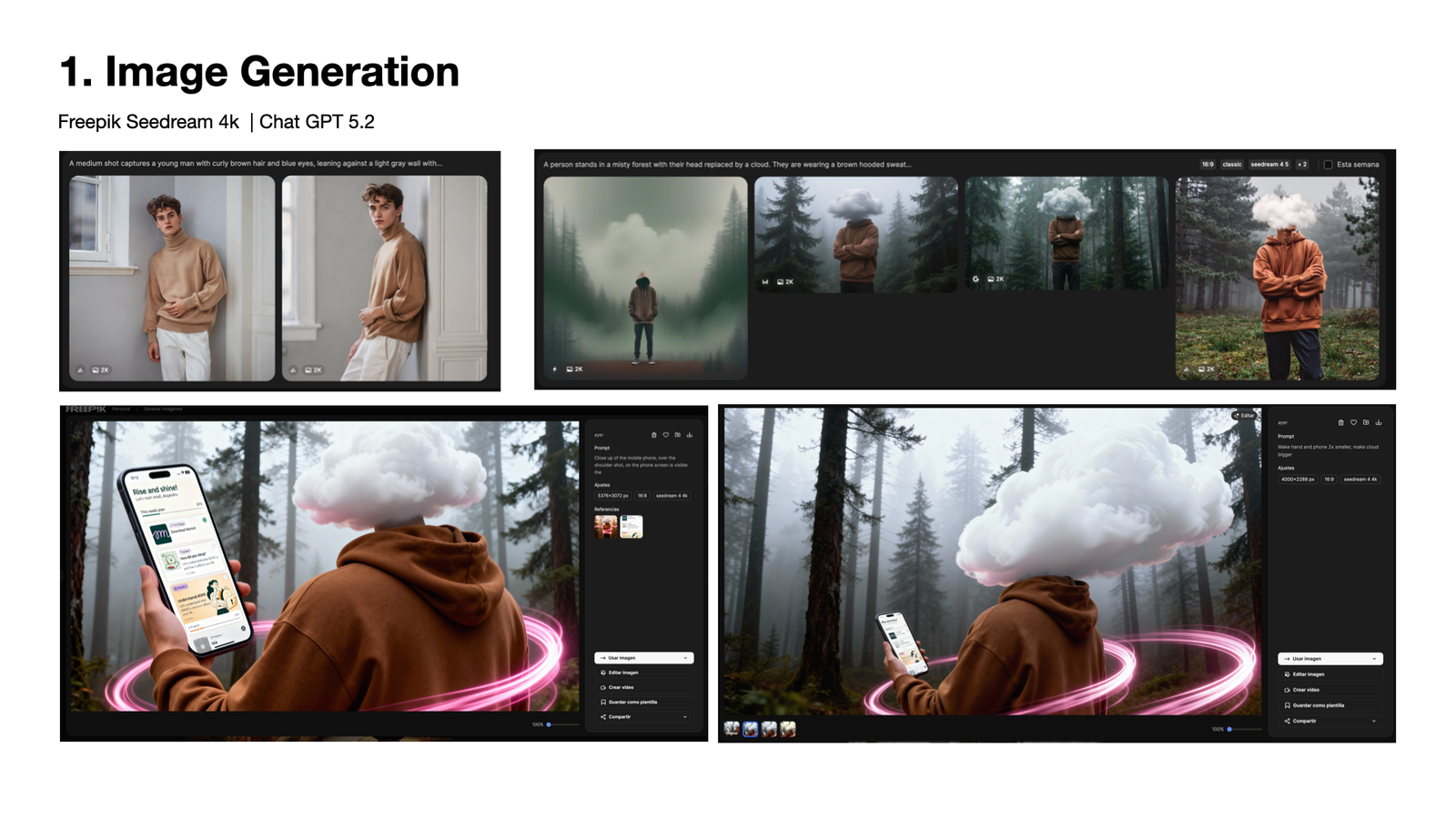
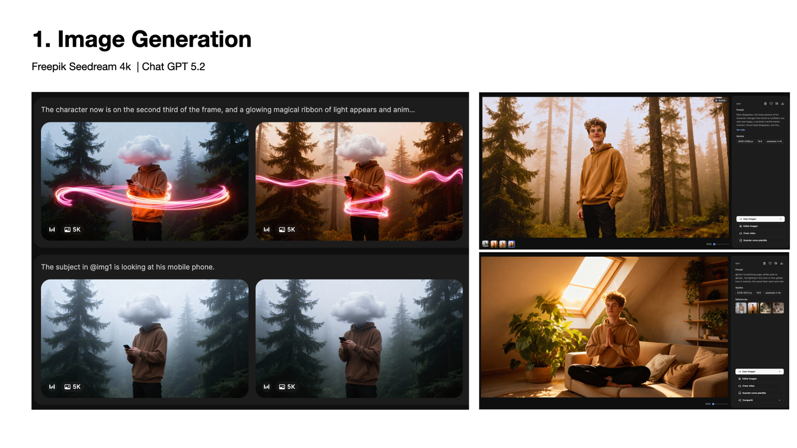
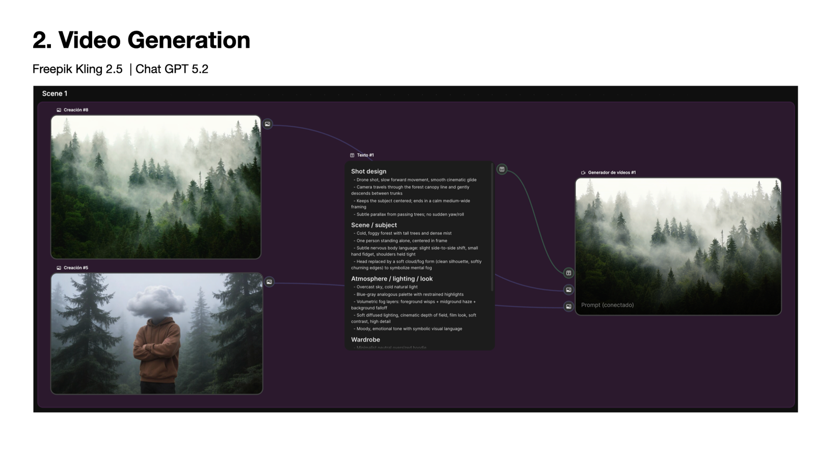
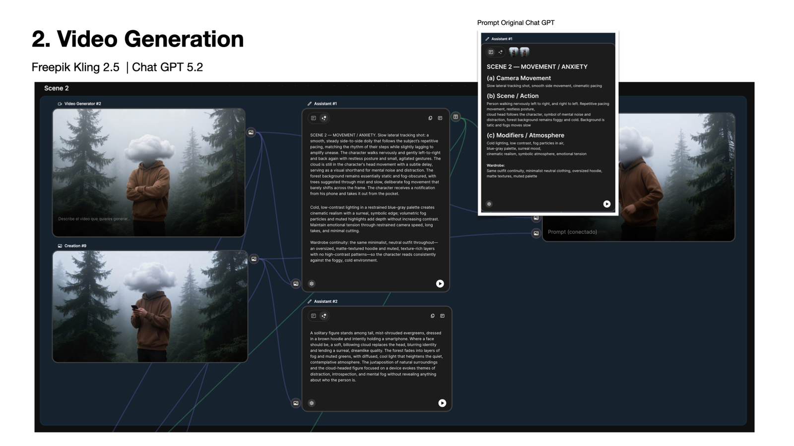
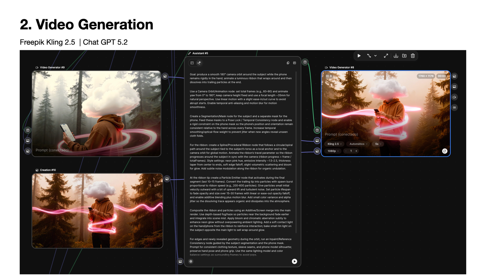
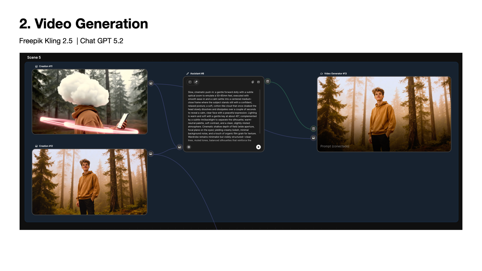
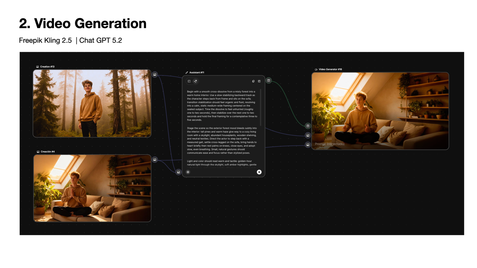
As part of a course on AI-powered creative production, I used Nomist as the subject of a fully AI-generated advertisement, taking the brand's visual language from the Design System and concept decks and extending it into motion and audio for the first time. The result is a 30-second spot that could realistically serve as Nomist's social ad. The full pipeline — from storyboard to final cut — used four AI tools in sequence, with ChatGPT 5.2 acting as the creative director across all of them.

PLAY

🤔 REFLECTION

This project asked me to solve for two things simultaneously that rarely appear together: the rigour of regulated product design, and the emotional intelligence required to serve users who are genuinely struggling. The concept exploration phase was where those two demands came into sharpest tension — and where the design thinking had to be most precise.

Calm Focus won not because it was the safer choice, but because it was the more honest one, the research was clear: ADHD users disengage when they feel like they're being entertained rather than supported. The teal-and-mist direction, rooted in nature and calm, was the right answer for a product that asks people to sit with difficult self-knowledge.

The AI video ad proved something that wasn't obvious at the start: the same structured prompting methodology that built the Design System transfers directly to motion production. The cloud-headed character from the mood board research ended up as the central figure in a 30-second spot. The visual metaphor that informed the color rationale became the narrative arc of an advertisement. The work had more coherence than I expected, because the thinking underneath it was consistent throughout.

Across the full project — concept exploration, Design System, and video ad — AI was a collaborator, not a replacement for judgment. What changed is where my time went: instead of spending it on work I wasn't qualified to do alone, I spent it on synthesis, design decisions, and craft.
Designosaur
Andrea's assistant  |  Online
Are we a match? 🦕 Ask me anything about Andrea — or describe what you're looking for and I'll give you a compatibility score.
ARE WE A MATCH? • ARE WE A MATCH? •